B2B

White label solution:
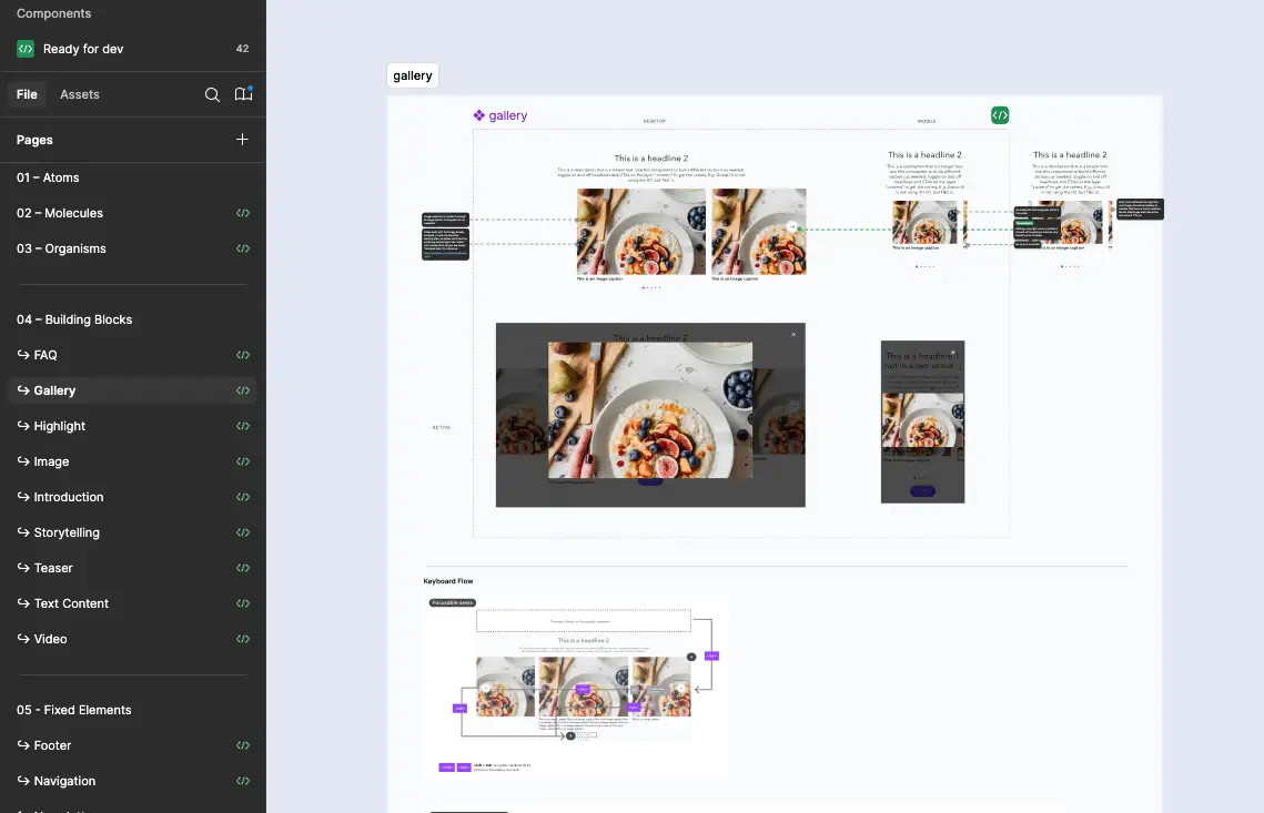
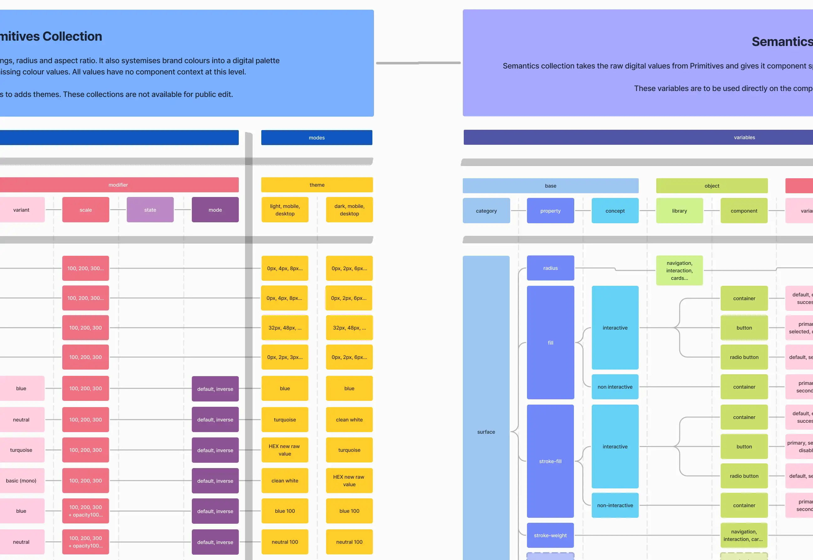
Building up a Design System

Overview

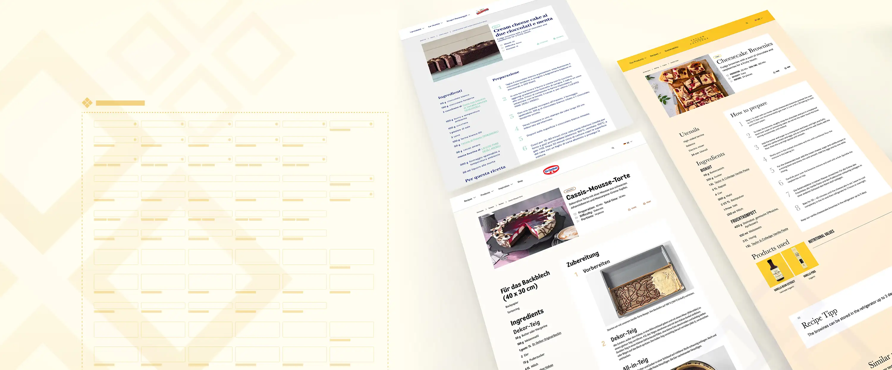
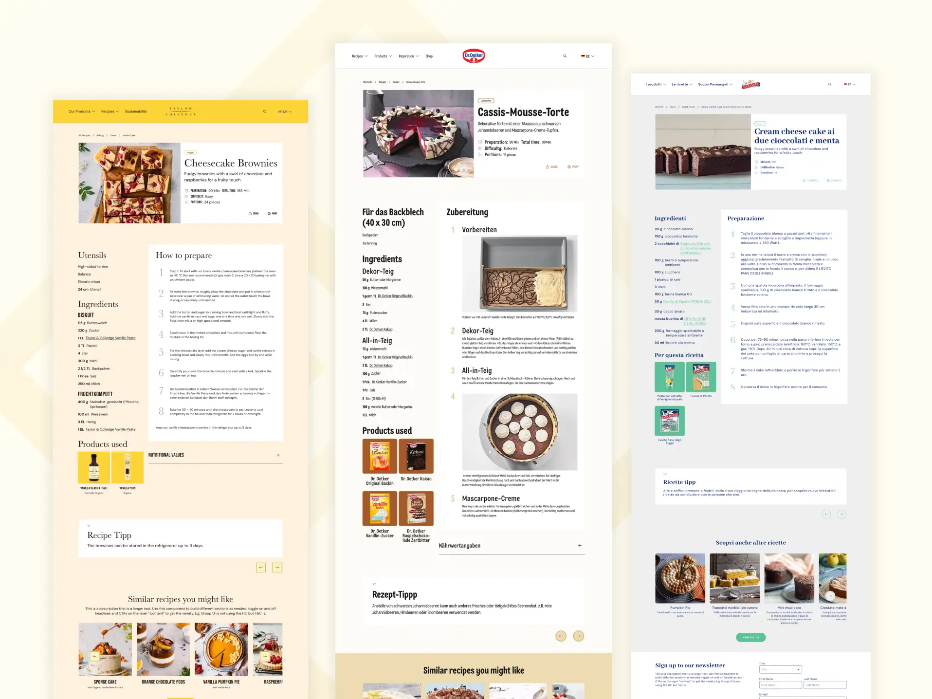
The objective of this white label solution is to provide a scalable and flexible solution that enables seamless migration of Dr. Oetker brands while ensuring brand identity consistency and leveraging a shared component library to minimize custom development. The system should be efficient, maintainable, and adaptable to future brand migrations.

Setup

Duration: January 2024 – today
Industry: Food
Role: Lead Product Designer

In a nutshell

UX / UI Design
Redesigning existing pages to fit new tech stack
Developing solutions for new tech stack
Solving feature and bug requests for multiple brands
Atomic design approach
Design System Development
Setup of component library
Overseeing freelance designers using our library
Developing solutions with our components
Developing new components if necessary
Stakeholder management
Handover to development in Figma and ClickUp
Planning and prioritising with responsible parties in the group companies

Details

Create a single-source-of-truth
As my development team is migrating the brand pages to a new tech stack, we wanted to use the chance and redefine the existing components that the brands' content editors build their pages with.
That's why I redesigned all of them in Figma. That way the design team has a source for creating new pages and a proper hand-over to development is ensured.
Specify design tokens for a multi-brand system
With design tokens we allow brand-specific theme customisations. To do that, I develop a variable taxonomy that covers all possible properties of our components and apply them to our components in Figma. Tokens that can't be represented as variables in Figma yet are set up as e.g. boolean properties and communicated to the development team.
Design System Utilization
When building new pages designers can now use the predefined UI components from the shared library wherever possible. With only one click we are able to create the same page (e.g. recipe detail page) in a different brand style.
Translated to code, content editors of the brands can drag and drop our templates into their CMS to build and edit new or existing pages.
Next up: Documenation
In the next phase all components that are added to the component library will be properly documented. The documentation will contains rules on how and when to use them correctly.
Content editors will be able to see annotations directly in the CMS with references to a broader documentation in Storybook, including usage scenarios, how tos and examples.
image source: Storybook